Brief:
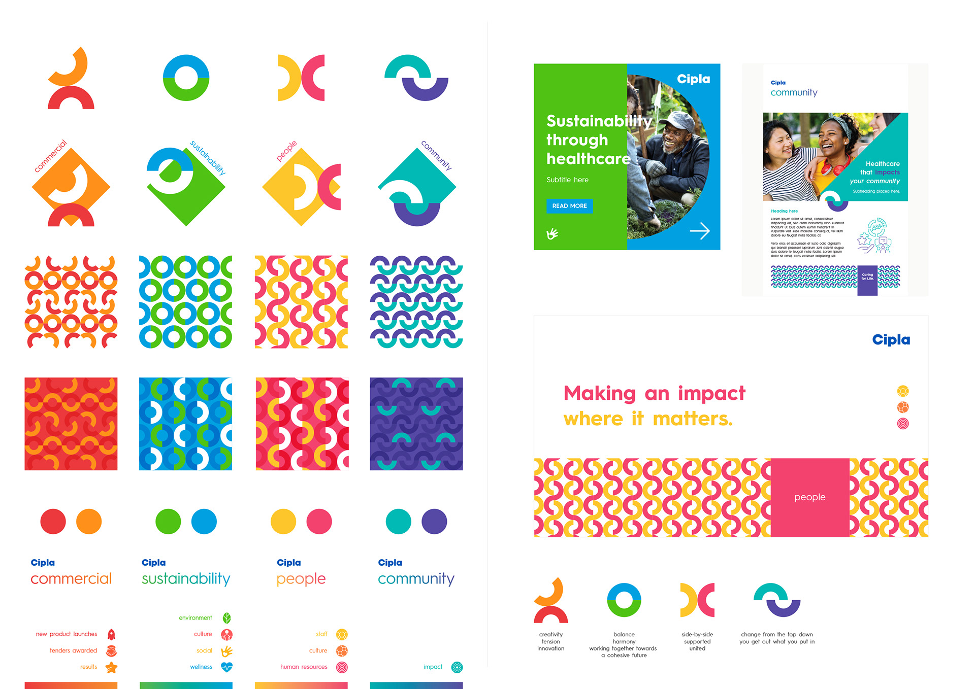
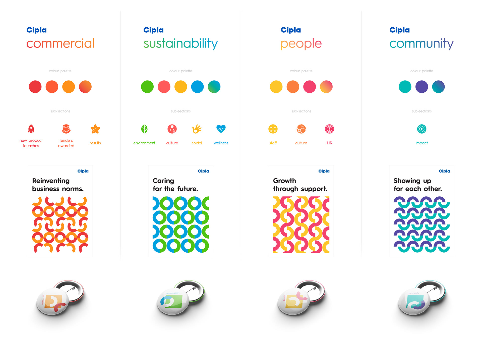
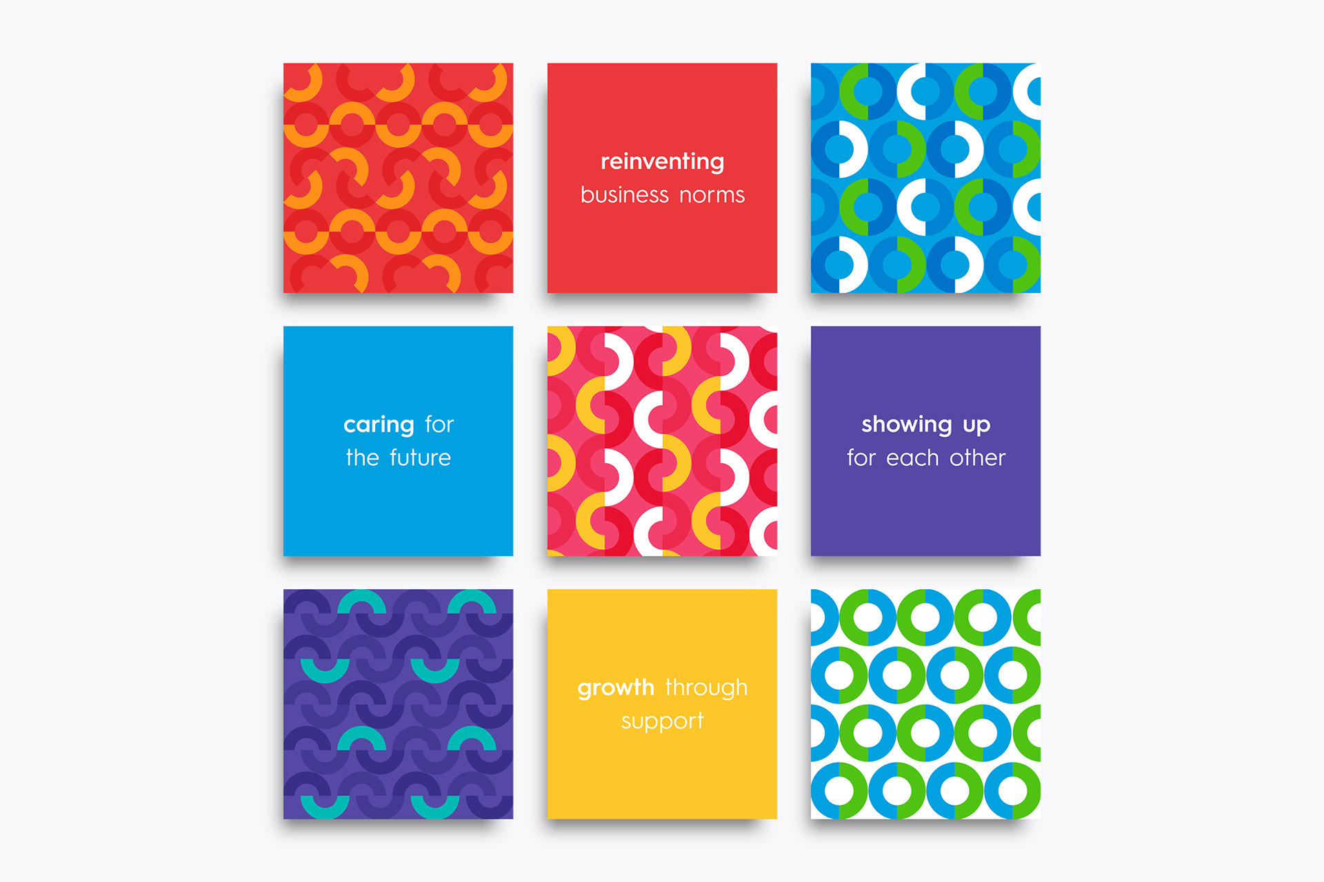
I was tasked with developing an internal communication system for the company’s four core pillars: Commercial, Sustainability, People, and Community. The goal was to create a visual language that clearly defined each pillar while aligning with the brand’s identity. The system needed to feel dynamic and engaging, especially in animated formats, to resonate with diverse internal audiences.
Solution:
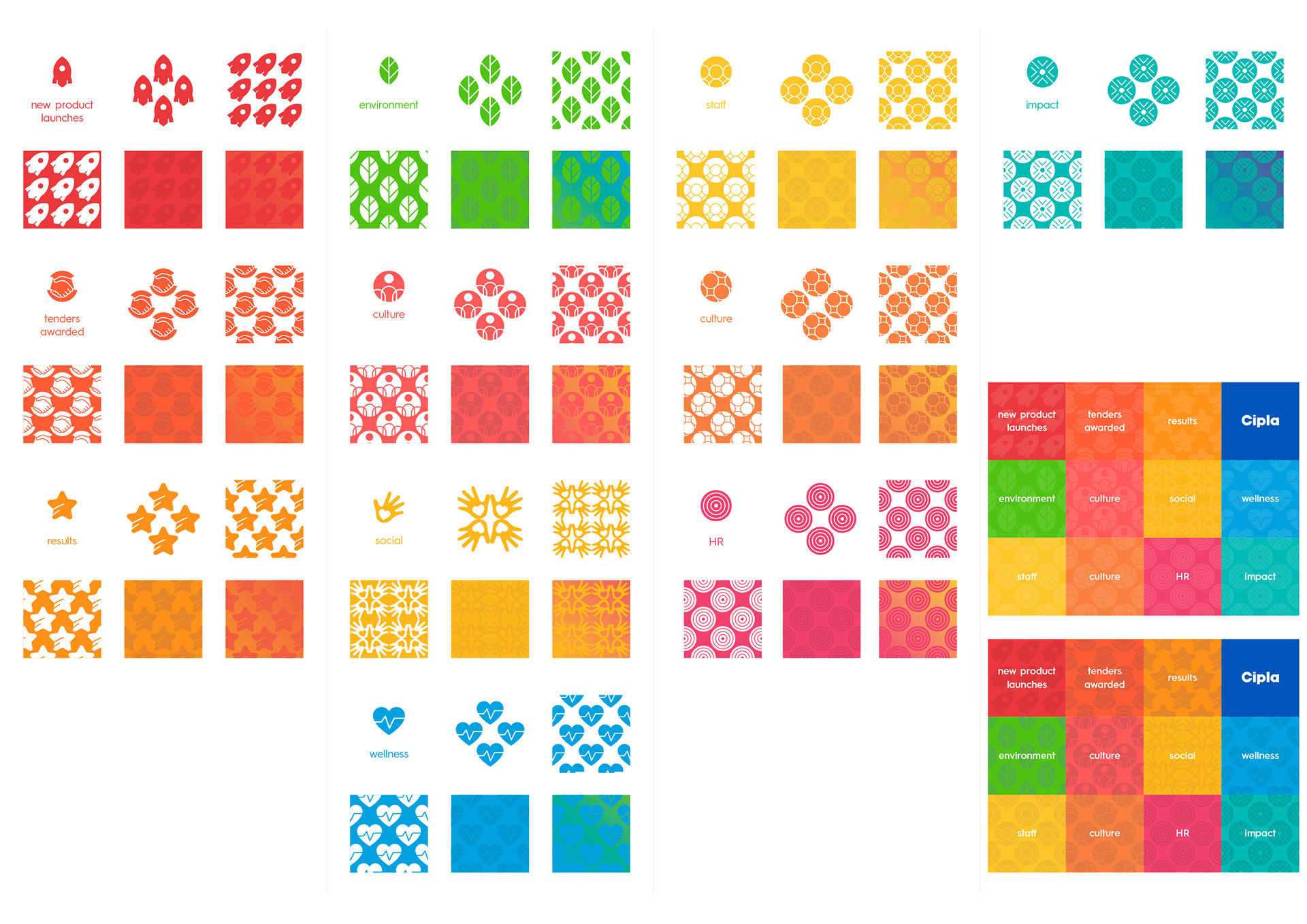
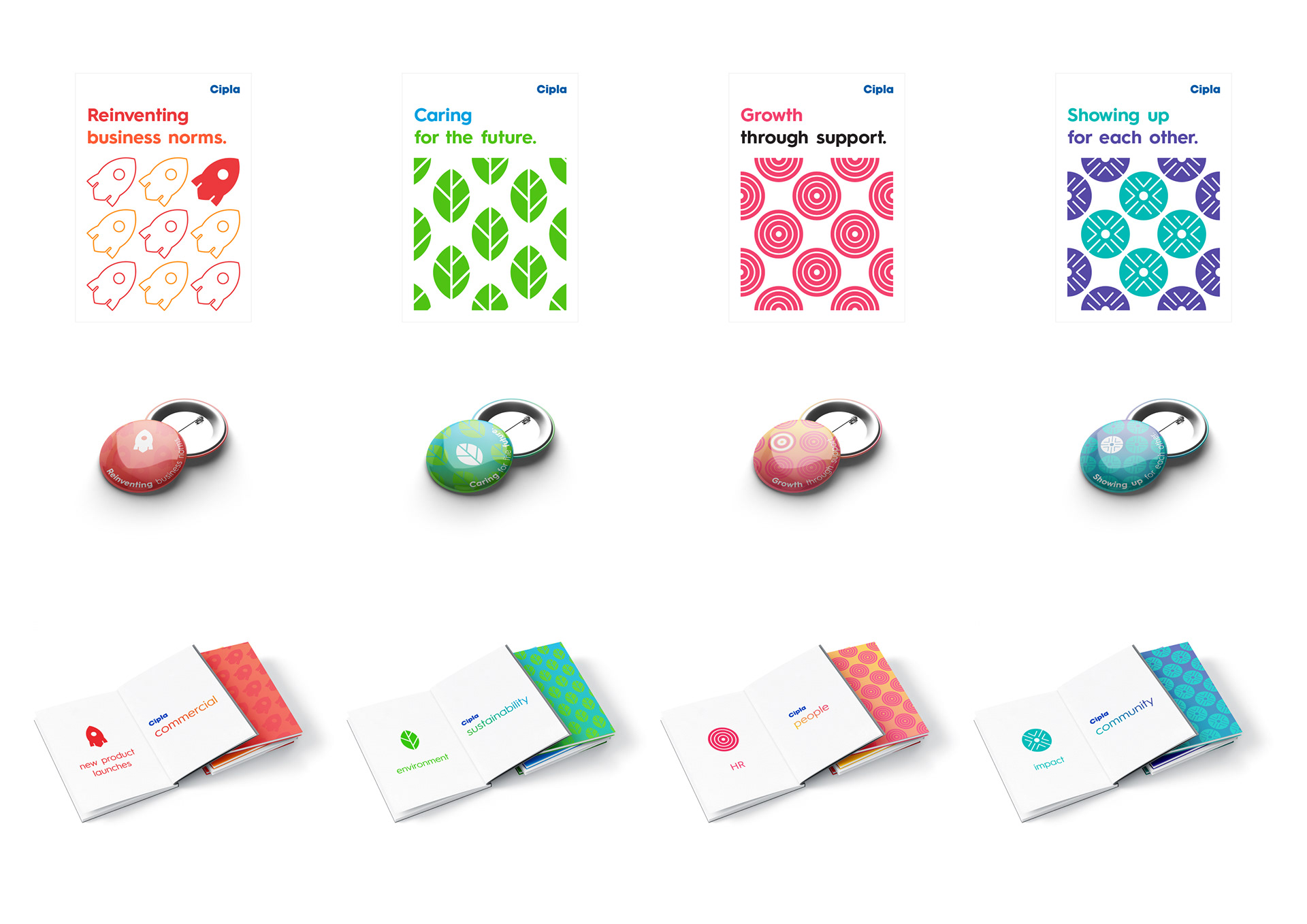
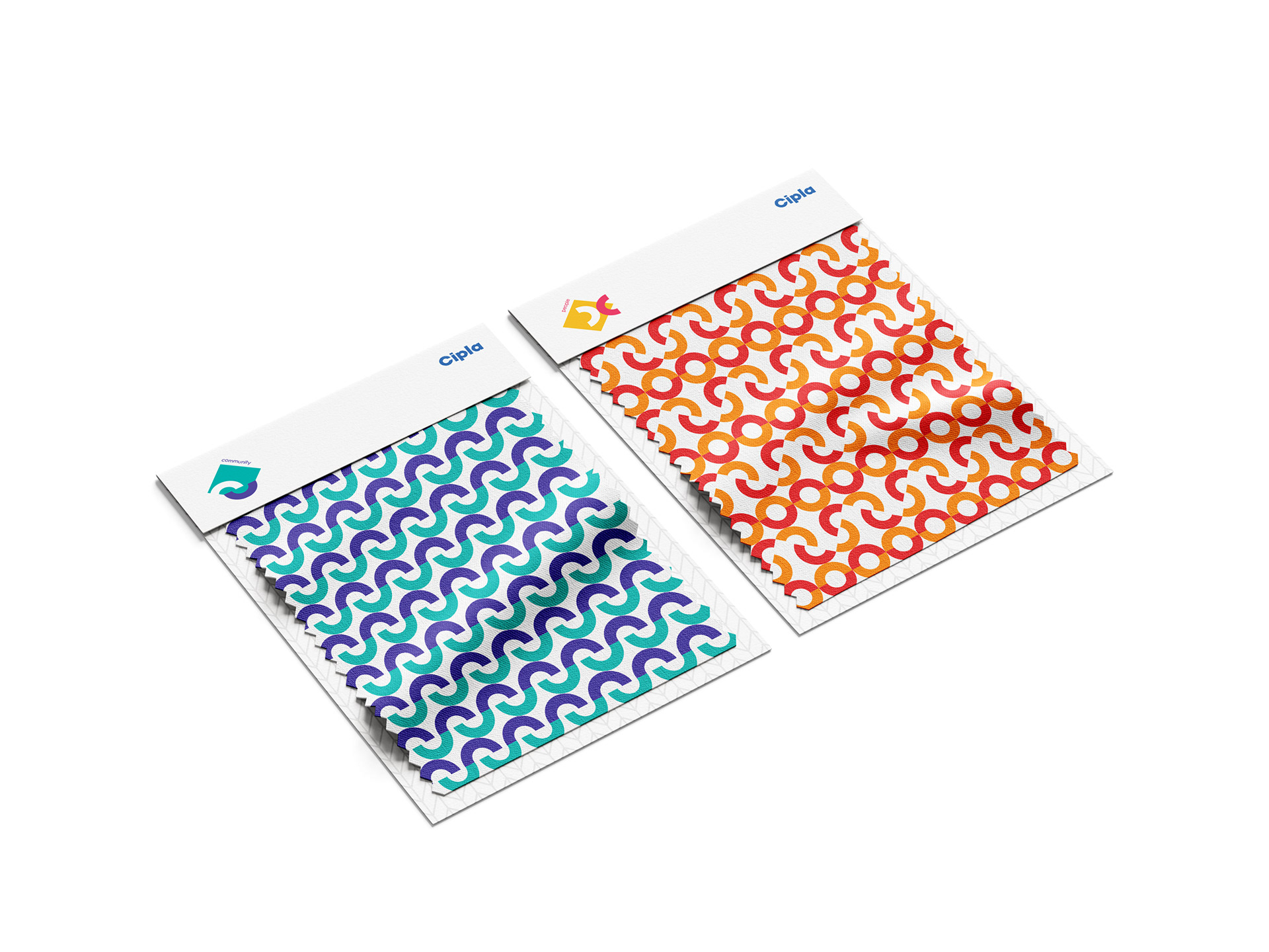
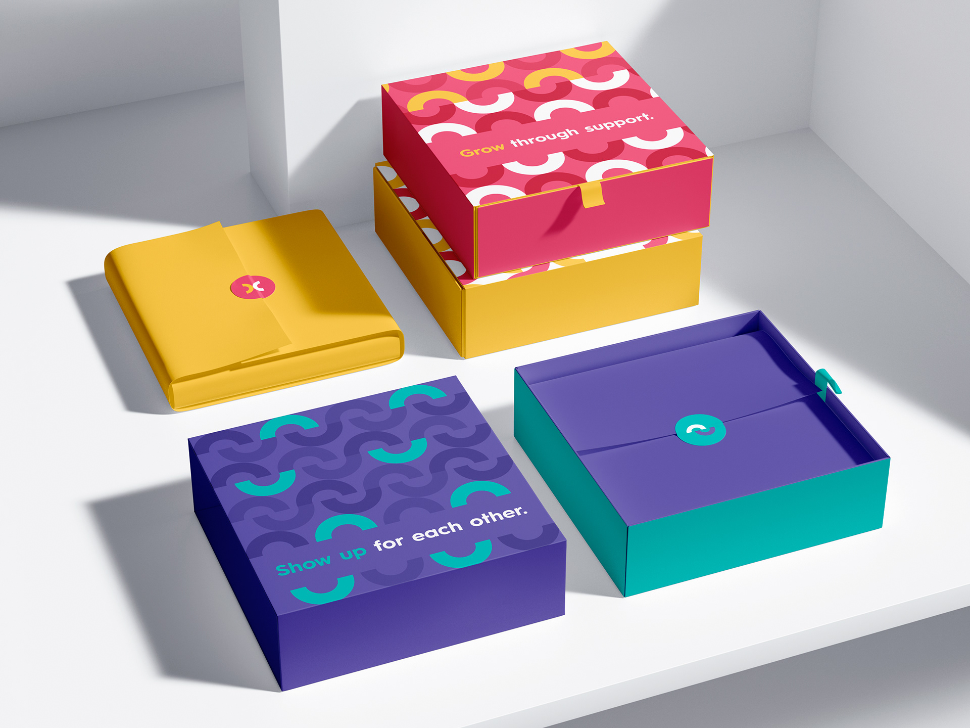
I adopted a vibrant, lively approach, leveraging the geometric shapes within the Cipla logo as the foundation for the design. These shapes were creatively arranged to evoke the essence of each pillar. To ensure clarity and differentiation, each pillar has its own unique colour palette, iconography, patterns, and visual subsections for internal use.
This cohesive yet distinct system highlights the importance of each category while reinforcing the brand’s unified identity.